Plotly Dash Interactive Mapping : Dash Leaflet & TiTiler
Following on from an article written by the team over at Plotly “5 Awesome Tools to Power Your Geospatial Dash App” ( 5 Awesome Tools to Power Your Geospatial Dash App | by plotly | Plotly | Jul, 2022 | Medium) by Hannah Ker, Elliot Gunn & Rob Calvin. I wanted to expand on this by outlining some of my experiments with Plotly-Dash for use with geospatial apps and analysis using Python.
I should start with some caveats and attributions: There are probably many ways to achieve what I want to do in this example, this is just one I have found that works well (I will aim to explore more of them in time). In addition, I am not a geospatial specialist and I consider myself a novice in these aspects of data science — so if any mistakes have been made then let me know.
I have chosen to write this article with a good amount of detail, with the aim that it may be helpful to someone/anyone, feel free to skip past any of the parts that don’t interest you or that you already know.
Finally, I have done my best to provide the correct attributions and “thank yous” to recognise those I have taken inspiration from, but if you feel I have missed someone again please let me know.
The What, How & Why:
So what am I aiming to do, how do I want to do it and why?
The What: I want to explore a very specific problem. How to use a large GeoTIFF dataset from the Global Wind Atlas (GWA) and view this on an interactive map which allows me to explore the data. The app should allow me to see the data via a pop-up or click event(in this case wind speed data).
The How: I want to achieve my interactive map by using the fantastic Plotly / Plotly Dash framework & Python. Ultimately this is a building block to a more detailed analytical app …but sometimes the building blocks deserve their own article.
The Why: The dataset I want to view is large (more about that later) so this makes it a challenging task. Also, the geospatial community in Python is brilliant and thriving but it can also sometimes feel impenetrable. This article will aim to explore just one method and how it was achieved but in a fair amount of detail, with the aim it can be followed by other relative novices like myself.
The Data
Let’s discuss the data I am trying to view/analyse:
The data I want to view comes from the Global Wind Atlas (GWA), specifically, it is wind speed at 100m AGL for the United Kingdom that has been downloaded as a GeoTIFF. I am not going to go into how this data is created (but if interested this can be found here) but I will explain what this data looks like.
The GWA GeoTIFF for the UK consists of wind speeds on a 250m grid for the entire UK. Therefore this GeoTIFF is a grid of data with a width of 7315 points by a height of 6368 points (i.e a lon/ lat / Wind Speed grid). If we converted this data into a Pandas Dataframe then we would have 46.5 million rows ( 7315 x 6368). So it is a considerable amount of data.
Furthermore, this is just for the UK. The GWA provides data for the rest of the world also, which we may want to use in the future. So ideally we are going to need a solution that scales beyond what we are using in this example. If we were to simply plot this on a map as a simple GeoTIFF then chances are we would likely crash our browser.
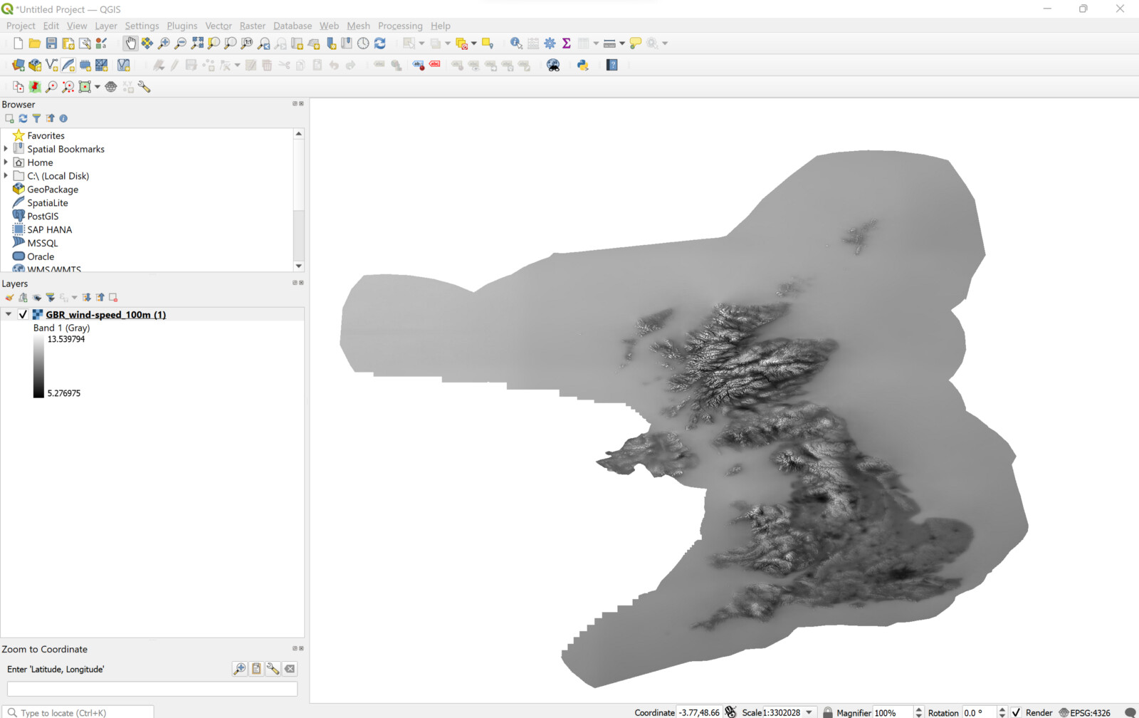
Once downloaded we can view this data in a GIS package such as QGIS (I should note we could also do analysis in this package and view the data on an interactive background map even but that doesn’t allow us to use this in an app so I am not going to focus on that here).
The Tools and Libraries
Plotly-Dash & Dash Leaflet
One of the major advantages of Plotly -Dash is its community, and its community components . When it comes to mapping /geospatial analysis one of the best is Dash-Leaflet developed and maintained by Emil Eriksen. This component brings the popular Javascript Leaflet library into the Python world via Plotly.
[ Side Note: Dash-Leaflet has a built-in method of seeing a Geotiff on an interactive map already ported over by Emil, called GeoTIFFOverlay. However, as noted above given the size of the data set this method will result in a crash as our system will run out of memory — for smaller data sets however this may be a more appropriate method. ]
TiTiler — The Tile Server
Given we have established it is a big data set we want to work with, we need a way to break down our data so that it can be presented in our browser. In order to achieve this, we will use the brilliant package TiTiler. TiTiler is a modern tile server built on top of FastAPI and Rasterio/GDAL.
TiTiler’s job is to take a type of Geotiff (called a Cloud Optimised GeoTIFF) and “serve” this to our interactive map. For this example, I will be using TiTiler running in Docker Desktop on my Local Host but it is equally possible to deploy it on a cloud platform like AWS , Azure etc for production( see docs for more info).
Cloud Optimised Geotiff (COG)
The key to all of this is really a file type called Cloud Optimized GeoTIFF (COG). A COG is a regular GeoTIFF file, aimed at being hosted on a HTTP file server, with an internal organization that enables more efficient workflows on the cloud. It does this by leveraging the ability of clients issuing HTTP GET range requests to ask for just the parts of a file they need.
cogeo.org explains the techniques that Cloud Optimized GeoTIFFs use, namely Tiling , Overviews , HTTP GET Requests and how these work together to make Cloud Optimised GeoTIFFs work. This is summarised below but please check cogeo.org for further info:
Tiling creates a number of internal “tiles” inside the actual image, instead of using simple “stripes” of data. With a stripe of data then the whole file needs to be read to get the key piece. With tiles, much quicker access to a certain area is possible, so that just the portion of the file that needs to be read is accessed.
Overviews create downsampled versions of the same image. This means it’s “zoomed out” from the original image — it has much less detail (1 pixel where the original might have 100 or 1000 pixels), but is also much smaller. Often a single GeoTIFF will have many overviews, to match different zoom levels. These add size to the overall file, but are able to be served much faster since the renderer just has to return the values in the overview instead of figuring out how to represent 1000 different pixels as one.
HTTP Version 1.1 introduced a very cool feature called Range requests. It comes into play in GET requests, when a client is asking a server for data. If the server advertises with an
Accept-Ranges: bytesheader in its response it is telling the client that bytes of data can be requested in parts, in whatever way the client wants. This is often called Byte Serving, and there’s a good wikipedia article explaining how it works. The client can request just the bytes that it needs from the server. On the broader web it is very useful for serving things like video, so clients don’t have to download the entire file to begin playing it.
The Range requests are an optional field, so web servers are not required to implement it. But most all the object storage options on the cloud (Amazon, Google, Microsoft, OpenStack etc) support the field on data stored on their servers. So most any data that is stored on the cloud is automatically able to serve up parts of itself, as long as clients know what to ask for.
Bringing them together
Describing the two technologies probably makes it pretty obvious how the two work together. The Tiling and Overviews in the GeoTIFF put the right structure on the files on the cloud so that the Range queries can request just the part of the file that is relevant.
Pre-Processing & Set up
Converting Geotiff to Cloud Optimised Geotiff
When we download the GeoTIFF from Global Wind Atlas this is not in the required Cloud Optimised GeoTIFF format. As such, we need to convert this — to do this we will use the Package rio-cogeo. We are going to use the Command-line Interface, However we still need to install rio-cogeo, this is done as usual, using pip in your terminal( i.e. pip install rio-cogeo ).
To convert our GeoTIFF to a cloud-optimised GeoTIFF, we should open a new terminal in the Python Environment you installed rio-cogeo and run the rio cogeo create command.
This command takes the following inputs in the order specified:
- The original GeoTIFF file location — i.e. the downloaded Geotiff from GWA.
C:\Users\Documents\GWA_Data\GWA_GBR_wind-speedP100m.tif. - The output file location (and name) — i.e. where we will write the file to.
C:\Users\Documents\GWA_Data\COG_GWA_WS100m.tif - Any Options you wish to use (see here) in my case the output compression Profile “deflate”
-p deflate& Data Type of output (-t) “ float 32”-t float32(as we are exporting wind speed and I wish to keep the decimal point we keep the data as a float)
As such the command window looks like the below:
Rio-Cogeo Command Line Interface method:
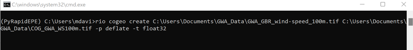
Assuming everything has run correctly you should now have a Cloud Optimised Geotiff called COG_GWA_WS100m .
AWS S3 Upload
As noted above, we need to store the data in a place that can accept a GET Request. In this instance, I will be using an AWS S3 bucket . We need to upload the COG and copy the object URL for use later . Depending on how you have set up your AWS S3 bucket , you may need to use the BOTO3 package. You could also use Google cloud storage or digital ocean etc for storage of the COG.
TiTiler set up
TiTler is the Tile server we are going to use , this is going to serve up our COG file from the AWS S3 Bucket. However , we first need to deploy TiTiler , I have chosen to use the Docker Image referred to on the TiTiler docs and used Docker desktop to do this , but you can use a multitude of different methods such as using uvicorn or even AWS Lambda.
Using TiTiler with Docker Desktop locally
Install Docker Desktop if you have not already and use the command line to pull the image from Github:
docker pull ghcr.io/developmentseed/titiler:latest
Once the image is pulled down it should appear in Docker Desktop, you will need to run the container and in the pop up select optional settings to enter the Local Host port you wish to run TiTiler on — in this case, we will be using 8080. This means that our TiTler endpoint will be running on http://localhost:8080
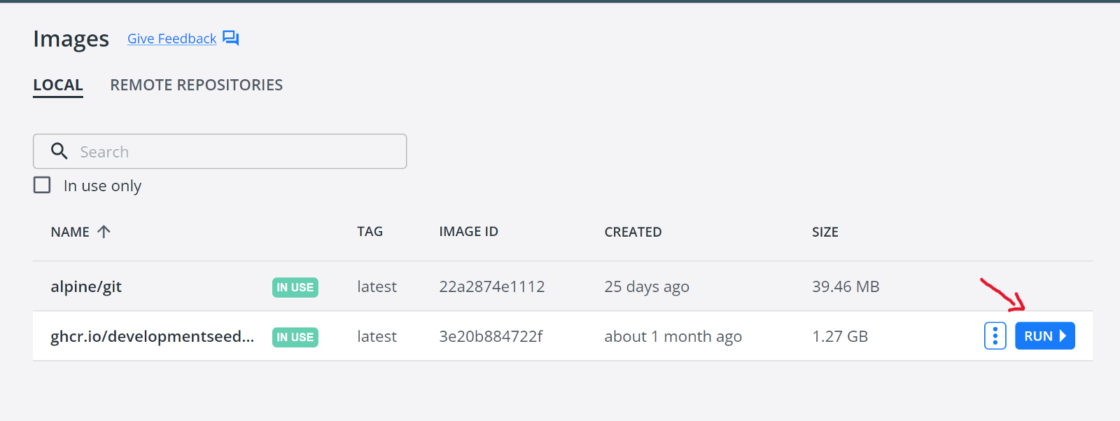
Click Run once the image is pulled
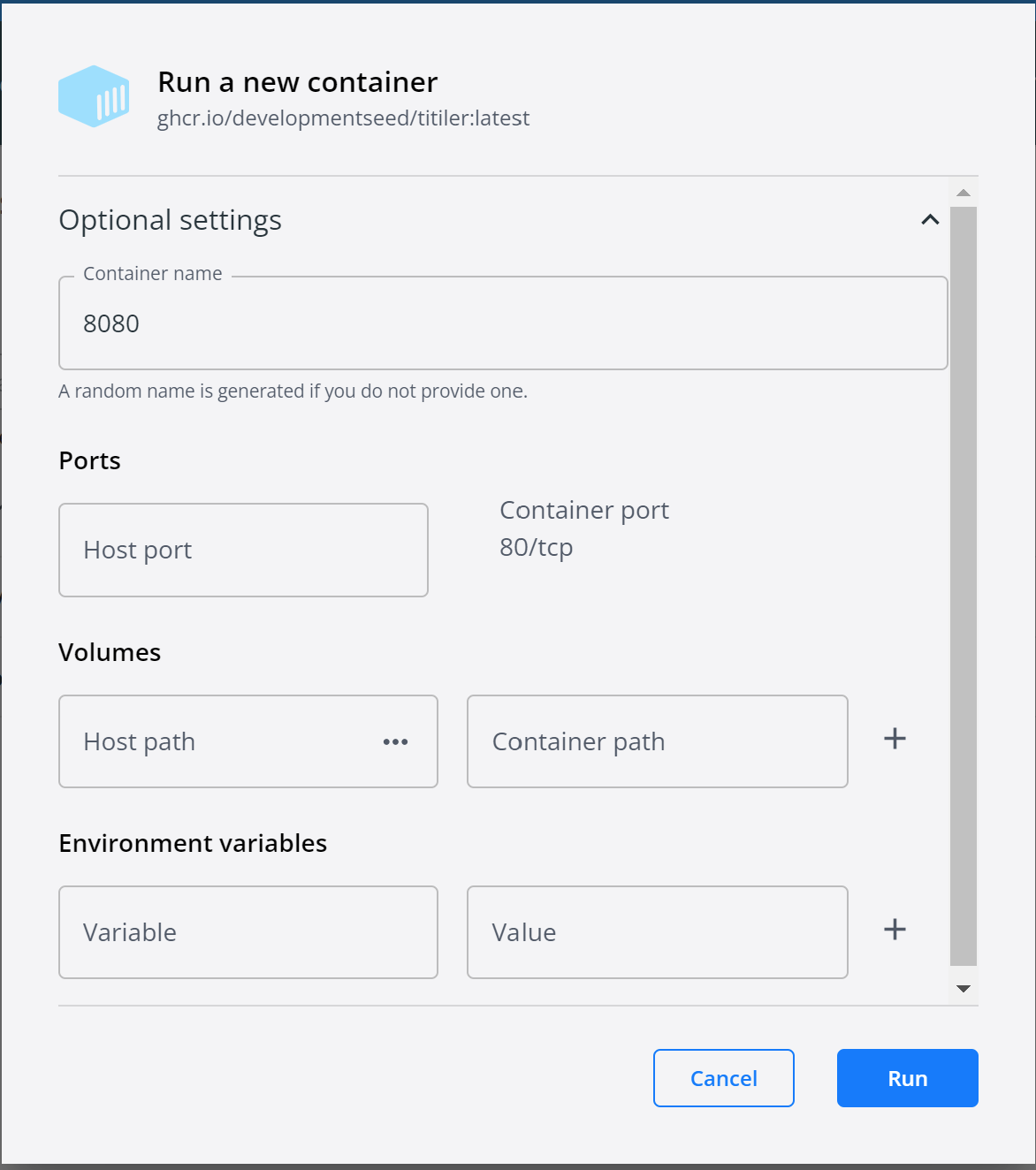
Optional settings change Port to Local Host required
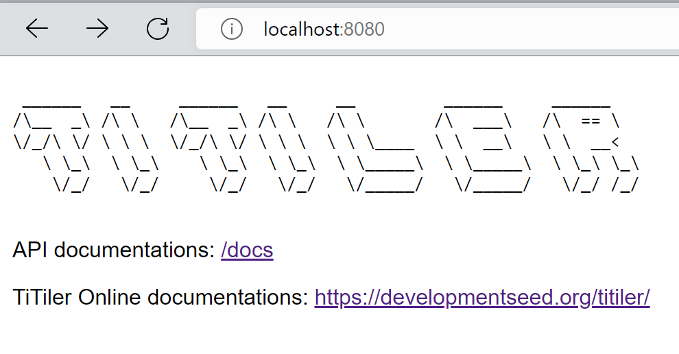
To check TiTiler is running, open a web browser to http://localhost:8080 and you should see something similar to below:
TiTiler running on local host 8080:
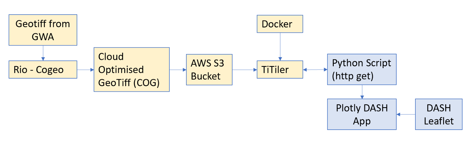
The pre-processing and setup for creating our app is now complete. To summarise the work we have done so far, the yellow cells below outline the work and the relationship between all the pre-processing steps. The next part of this article will now focus on the blue sections, which is the use of TiTiler in Plotly DASH.
Building Our Simple Map Application
Let’s import the required libraries for building our app:
#Import PLotly Dash , Dash Leaflet (for mapping), Jupyter Dash (for using dash/dash leaflet in notebook),
# Import  Json & httpx for getting data from TiTiler
from jupyter_dash import JupyterDash
from dash import Dash, html,dcc,Input, Output
import dash_leaflet as dl
import json
import httpx
We are building the app using Plotly Dash so we are importing Dash. I am also importing a package called JupyterDash which is also made by Plotly. This package simply allows us to create our Dash App in a Jupyter-Notebook, which is my preferred way of working. We also import dash_leaflet which is the component that brings the popular JavaScript Leaflet library into the Python world via Plotly.
The final two elements imported json and httpx will be used for getting data from TiTiler.
[Note: These libraries will have to be installed using Pip or Conda before they can be imported. I have skipped this step here. ]
For TiTiler to work we need to provide it with two things:
- The
TiTiler Endpoint - The
URLto our Cloud Optimised GeoTIFF stored on AWS S3.
For this example, our TiTiler endpoint will be running on my local host (via Docker). I have saved my S3_URL in a txt file here for privacy here but this is simply the Object URL noted above in the AWS S3 section.
let’s set TiTiler endpoint & URL:
#Set TiTiler endpoint as local host
#Titiler is running using Docker Image
#Local host is running on port 8080 , this is set in Docker desktop when running the image.
#Url refers to a S3 bucket
#Note: .tiff is a Cloud Optomised Geotiff[COG] , .tiff must be a COG!!!

S3_URL = open("Resource_Files\S3_URL.txt").read() # this is my S3 bucket URL saved in txt file for privacy


titiler_endpoint = "http://localhost:8080"  # titiler docker image running on local .
url = S3_URL
With our TiTiler Endpoint and URL set we can start interacting with our Cloud Optimised GeoTIFF using GET requests using httpx.get
As our data is stored in Float 32 format then one of the first things we need to do is get an idea of the Max and Min values in our data set. This is needed as we will need to rescale our tile map, if we did not do this our data would come back to us with a range of 0–255 (which would not make any sense). Instead, we need this data to be scaled to the wind speed min and max .
This is achieved using TiTiler cog/statistics and extracting min and max from the returned dictionary as below:
# Extract min and max values of the COG , this is used to rescale the COG
r = httpx.get(
    f"{titiler_endpoint}/cog/statistics",
    params = {
        "url": url,
    }
).json()

minv = (r["1"]["min"])
maxv = (r["1"]["max"])
minv & maxv represent the min and max wind speed in our data set. We can use these in retrieving our tile map from TiTiler, which ensures that our data comes back in the required scale.
#get tile map from titiler endpoint and url , and scale to min and max values

r = httpx.get(
    f"{titiler_endpoint}/cog/tilejson.json",
    params = {
        "url": url,
        "rescale": f"{minv},{maxv}",
        "colormap_name": "viridis"
    }
).json()
If we look at the returned variable r from the above code in a variable viewer we would see a dictionary item, within which we will have an item called "Tiles" with a corresponding variable looking something similar to: http://localhost:8080/cog/tiles/WebMercatorQuad/{z}/{x}/{y}@1x?url= S3_URL this is our tile map.
Before we build our map using the above data from TiTiler , I want to just create one function which I will use on the map to display the wind speed at the location of the user click. I will again use a httpx.get function alongside the in-built TiTiler function cog/point/{lon}/{lat} .
[Note: I have set the resampling to average which takes the distance weighted average of the nearest points, rather than say nearest , which simply takes the nearest value. ]
#create function which uses "get point" via titiler to get point value. This will be used in dash to get
#point value and present this on the map


def get_point_value(lat,lon):

    Point = httpx.get(
        f"{titiler_endpoint}/cog/point/{lon},{lat}",
        params = {
            "url": url,
            "resampling": "average"

        }
    ).json()


    return "{:.2f}".format(float(Point["values"][0]))
This function simply runs a get request using the latitude and longitude it is passed.
Building a Simple Dash App
So above we have our code for getting the Tile Map & we have also created a function, whereby if we give it a latitude and longitude we will get a returned wind speed. That’s the beginning of our app, so let’s start bringing that together.
For completeness I have copied the full app code below, I will break this down further in the proceeding sections but if you don’t want or need to read that, then the below code will create a map using our tile map and allow you to click and get a wind speed displayed in an info panel.
#Build Dash app (note: JupyterDash is being used here but will work in external dash app , to see this change last line to "mode=External")

app = JupyterDash(__name__)

#create the info panel where our wind speed will be displayed
info = html.Div( id="info", className="info",
                style={"position": "absolute", "bottom": "10px", "left": "10px", "z-index": "1000"})

#Create app layout
#dash leaflet used to create map (https://dash-leaflet.herokuapp.com/)
#dl.LayersControl, dl.overlay & dl.LayerGroup used to add layer selection functionality
app.layout = html.Div([
dl.Map(style={'width': '1000px', 'height': '500px'},
               center=[55, -4],
               zoom=5,
               id = "map",
               children=[
            dl.LayersControl([

                   dl.Overlay(dl.LayerGroup(dl.TileLayer(url="https://cartodb-basemaps-{s}.global.ssl.fastly.net/light_nolabels/{z}/{x}/{y}.png",id="TileMap")),name="BaseMap",checked=True),
                   #COG fed into Tilelayer using TiTiler url (taken from r["tiles"][0])
                   dl.Overlay(dl.LayerGroup(dl.TileLayer(url=r["tiles"][0], opacity=0.8,id="WindSpeed@100m")),name="WS@100m",checked=True),
                   dl.LayerGroup(id="layer"),
                # set colorbar and location in app
                   dl.Colorbar(colorscale="viridis", width=20, height=150, min=minv, max=maxv,unit='m/s',position="bottomright"),
                   info,

])
])
])
# create callback which uses inbuilt "click_lat_lng" feature of Dash leaflet map, extract lat/lon and feed to get_point_value function , WS fed to output id = info (which is info html.div)
@app.callback(Output("info", "children"), [Input("map", "click_lat_lng")])
def map_click(click_lat_lng):

    lat= click_lat_lng[0]
    lon=click_lat_lng[1]

    return get_point_value(lat,lon)


app.run_server(debug=True,mode='inline')
OK, lets break this down into the component parts:
Firstly , lets start with the very first line and the very last line of the code above, app = JupyterDash(__name__) and app.run_server(debug=True,mode='inline') .
These are component parts of any JupyterDash app and are the same as writing app = Dash(__name__) and app.run_server(debug=True) at the start and end of any other Dash app but simply changed a little because I am using JupyterDash.
Apart from changing Dash to JupyterDash, the only other thing to note is the extra command of mode=’inline’ in app.run_server. This simply tells JupyterDash to display the output of the app in the Jupyter Notebook rather than in our browser on localhost 8050 as is more common in regular Dash apps. (Note: if we did want to display the app in our browser but still wanted to use JupyterDash we would just change this to mode=’external’ )
The next section of code simply creates the Info panel we will display the wind speed once the user clicks the map. This info panel is a simple html.Div with the position fixed to the bottom left of the map/app.
Create the info panel
`#create the info panel where our wind speed will be displayed
info = html.Div( id="info", className="info",
                style={"position": "absolute", "bottom": "10px", "left": "10px", "z-index": "1000"})`
The next section of code is the main part of our app. The app is really simple and only consists of a dash leaflet map ( dl.map ) in a html.Div . There are two layers to the map , the basemap which is fed in as a Tilelayer using dl.Tilelayer and the COG from TiTiler we got using the httpx.get request which we assigned to the variable r . In the code we are extracting the "tiles" item from the returned dictionary and displaying this as a second Tilelayer ( dl.Tilelayer ).
The dl.LayersControl , dl.Overlay and dl.LayerGroup are all layer controls to that allow for each layer to be turned on and off, allow for some easy user functionality.
dl.colorbar simple shows a colour bar on the map which where i have used the previously calculated minv and maxv to provide the scale .
app.layout = html.Div([
dl.Map(style={'width': '1000px', 'height': '500px'},
               center=[55, -4],
               zoom=5,
               id = "map",
               children=[
            dl.LayersControl([

                   dl.Overlay(dl.LayerGroup(dl.TileLayer(url="https://cartodb-basemaps-{s}.global.ssl.fastly.net/light_nolabels/{z}/{x}/{y}.png",id="TileMap")),name="BaseMap",checked=True),
                   #COG fed into Tilelayer using TiTiler url (taken from r["tiles"][0])
                   dl.Overlay(dl.LayerGroup(dl.TileLayer(url=r["tiles"][0], opacity=0.8,id="WindSpeed@100m")),name="WS@100m",checked=True),
                   dl.LayerGroup(id="layer"),
                # set colorbar and location in app
                   dl.Colorbar(colorscale="viridis", width=20, height=150, min=minv, max=maxv,unit='m/s',position="bottomright"),
                   info,

])
])
])
Finally, we have the @Callback . The callback in a Dash app contains the code that is triggered on a input being triggered . This could be a slide of a slider , a checkbox being checked and so on. In this case the Input is the click of the map. The output of this callback is our info panel we built above as noted by the id matching .
click_lat_lng is an inbuilt feature of Dash-Leaflet which provides the latitude and longitude of the click location. On clicking the map , the latitude and longitude is passed to the function we defined above get_point_value which retrieves the wind speed from that location — which is then fed to the output info panel.
# create callback which uses inbuilt "click_lat_lng" feature of Dash leaflet map, extract lat/lon and feed to get_point_value function , WS fed to output id = info (which is info html.div)
@app.callback(Output("info", "children"), [Input("map", "click_lat_lng")])
def map_click(click_lat_lng):

    lat= click_lat_lng[0]
    lon=click_lat_lng[1]

    return get_point_value(lat,lon)
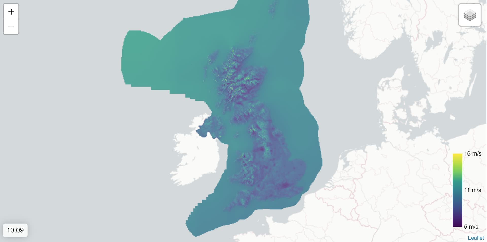
All going well , you should see a map similar to the Gif below. This is a large geoTIFF displayed on a Dash app using Dash-Leaflet and TiTiler.
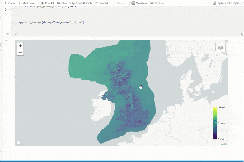
Dash Leaflet & TiTiler displaying GWA data on interactive map
The full Notebook for this guide can be found at link below: